
5 Google Sheets Chart Types Every Business Dashboard Needs
Data without visualization is just numbers. Here are the 5 chart types you should include in any business dashboard built with Google Sheets.
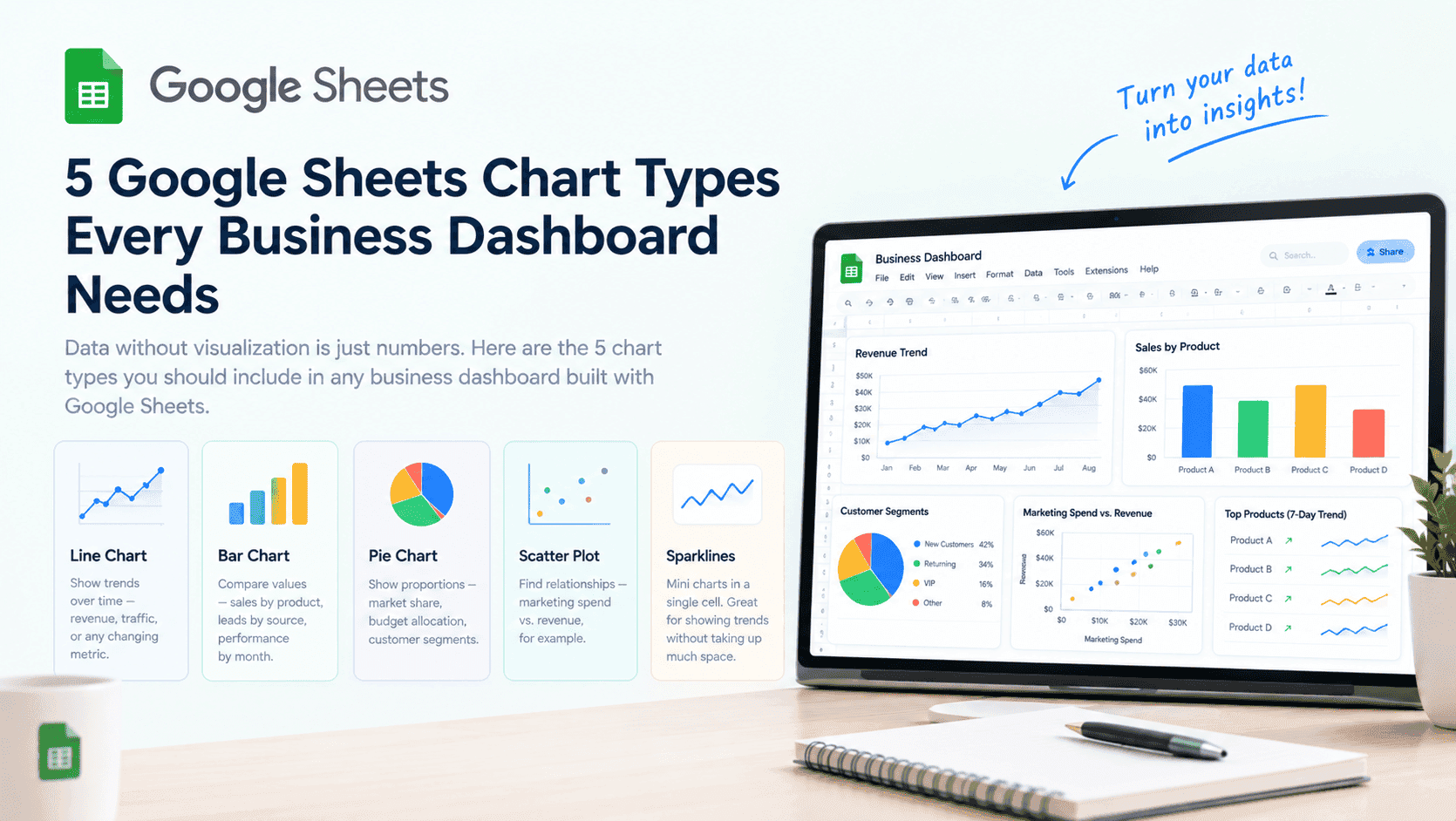
Visualizing your data is essential for making informed decisions. Here are the five chart types that every business dashboard needs:
At Sutra Analytics, we build custom Google Sheets dashboards with all these chart types. We connect your data sources and create visualizations that give you real-time insights into your business.
1. Line Charts: Trends Over Time
- Best Uses: Revenue over 12 months, Website traffic by day/month, Customer growth over time, Monthly expenses
- Setup Tips: Use consistent time intervals, Add trend lines, Use multiple lines to compare data sets
2. Bar Charts: Comparisons
- Best Uses: Sales by product/category, Leads by source, Performance by team member, Budget allocation
- Setup Tips: Sort bars highest to lowest, Use horizontal bars for long names, Use stacked bars for composition
3. Pie Charts: Proportions
- Best Uses: Market share, Budget allocation, Customer segments, Channel contribution
- Setup Tips: Limit to 5-7 slices, Sort largest to smallest, Use percentages instead of raw numbers, Consider a donut chart
4. Scatter Plots: Relationships
- Best Uses: Marketing spend vs. revenue, Employee hours vs. output, Ad spend vs. conversion rate, Price vs. demand
- Setup Tips: Use different colors for categories, Add a trend line, Label outliers for context
5. Sparklines: Mini Trends in a Single Cell
- Best Uses: Product sales trends, Stock price movements, Individual employee performance, Small multiples for many items
- Setup Tips: Use the SPARKLINE function, Choose chart type: line, bar, column, or winloss, Adjust colors and styles
Additional Chart Types to Consider (We Build These Too)
- Area Charts: Line charts with filled area below
- Combo Charts: Combine two chart types (bar + line)
- Histograms: Show distribution of data
- Waterfall Charts: Show cumulative effect of positive and negative values
- Gauge Charts: Show progress toward a goal
Best Practices for Dashboard Charts (We Follow)
- Keep it simple: One chart should show one main message
- Use consistent colors across charts
- Label axes clearly
- Include a title that explains what the chart shows
- Add a data source note for credibility
- Use meaningful colors (red for negative, green for positive)
- Consider your audience: What do they need to know?
How to Create Charts in Google Sheets
- Select your data
- Click Insert → Chart
- Choose chart type from the Chart Editor
- Customize: Colors, labels, axes, gridlines
- Move to your dashboard sheet
- Set up automatic data updates
Example Dashboard Layout (We Build For You)
- Top Row: Key Metrics (revenue, profit, customers) as Big Numbers
- Second Row: Line chart showing trends over time
- Third Row: Bar chart comparing categories
- Fourth Row: Pie chart showing composition
- Bottom Row: Table with detailed data
Use these chart types to turn your data into insights.
Need a Custom Google Sheets Dashboard?
Let Sutra Analytics build you a custom dashboard with all these chart types. We connect your data sources and create visualizations that give you real-time insights. Contact us today for a consultation.
— Sutra Analytics Team